The most successful marketing campaigns apply customer psychology.
On the surface, it’s a simple concept.
If you understand how the customer’s mind works, you can use certain triggers to help you generate a profit.
One of the most important psychological factors you need to consider is color.
Keep it in mind when you’re:
- branding your company logo
- designing your website
- building a mobile application
- creating a call-to-action button
- sending an email
- coming up with a marketing campaign.
Basically, anything visual your company produces needs to have appropriate color schemes.
The right colors can lead to a conversion, while the wrong colors can leave a customer with a negative impression of your company (which you obviously want to avoid).
Let’s take a look at something as simple as gender as it relates to favorite colors:

Blue is for men and pink is for women, right?
Think again.
According to a recent study (image above), both men and women said blue was their favorite color.
Clearly, just because newborn babies are typically put in either blue or pink doesn’t mean grown adults feel the same way.
Here’s more from that same study that shows the least popular colors based on gender:
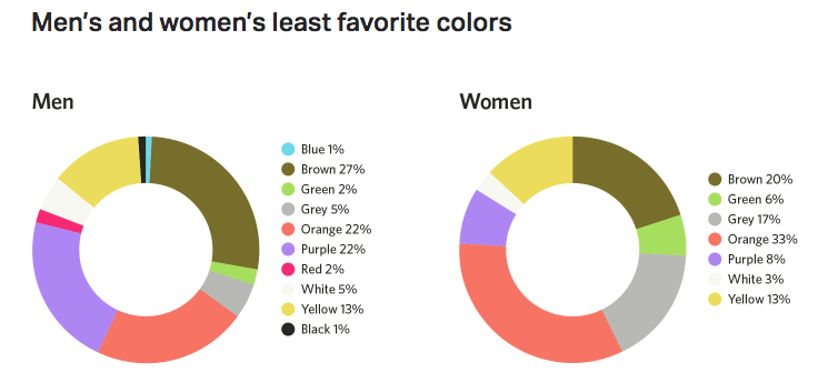
Both men and women dislike brown and orange.
But why?
I’ll explain the psychology behind different colors so you can adjust your marketing tactics accordingly.
Changing a website’s colors can help you increase sales for your business.
Blue
Let’s start off by discussing the color blue since we already established it’s the favorite color for both men and women.It represents security, trust, and dependability.
Blues also signify spirituality and calmness.
With so many different shades of blue out there, which one should you choose for your website?
Light blue shades work best for friendly websites that have a social and calm concept.
Use dark blue hues for corporations and businesses.
Here’s a visual representation of the top 10 most valuable brands in the world:
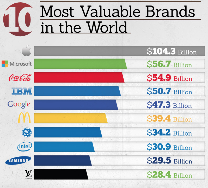
Do you notice a pattern here?
Half of these businesses have a shade of blue in their logos.
Based on everything we just discussed, this shouldn’t be a surprise.
Depending on your company, blue may be a top choice for your website.
Green
We associate green with the word “go”.It represents life, nature, wealth, and harmony.
Green colors also symbolize freshness, the environment, and something new.
With that said, these associations are not universal across the globe.
Keep that in mind when you’re designing a website.
Here’s how people in different geographic locations perceive the color green:
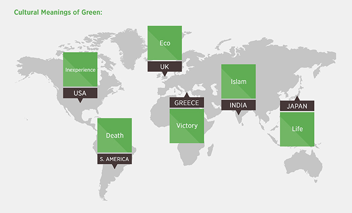
Look at some of the polar opposite representations here.
In Japan, green represents life.
But in South America, it signifies death.
Make sure you understand your primary target audience and what colors mean to their culture.
Here’s a great example of how Animal Planet incorporates greens into their website design:

Why?
Like I said before, in our culture, green symbolizes nature and the environment, so it works well with the overall theme of their brand.
Pink
Even though pink wasn’t every woman’s favorite color, it still represents femininity.For those of you running a business primarily geared toward men, I’d recommend staying away from pink tones.
Pink stands for love, sexuality, nurture, sweetness, and warmth.
Look at how a gender specific brand like Victoria’s Secret uses pink on their website:
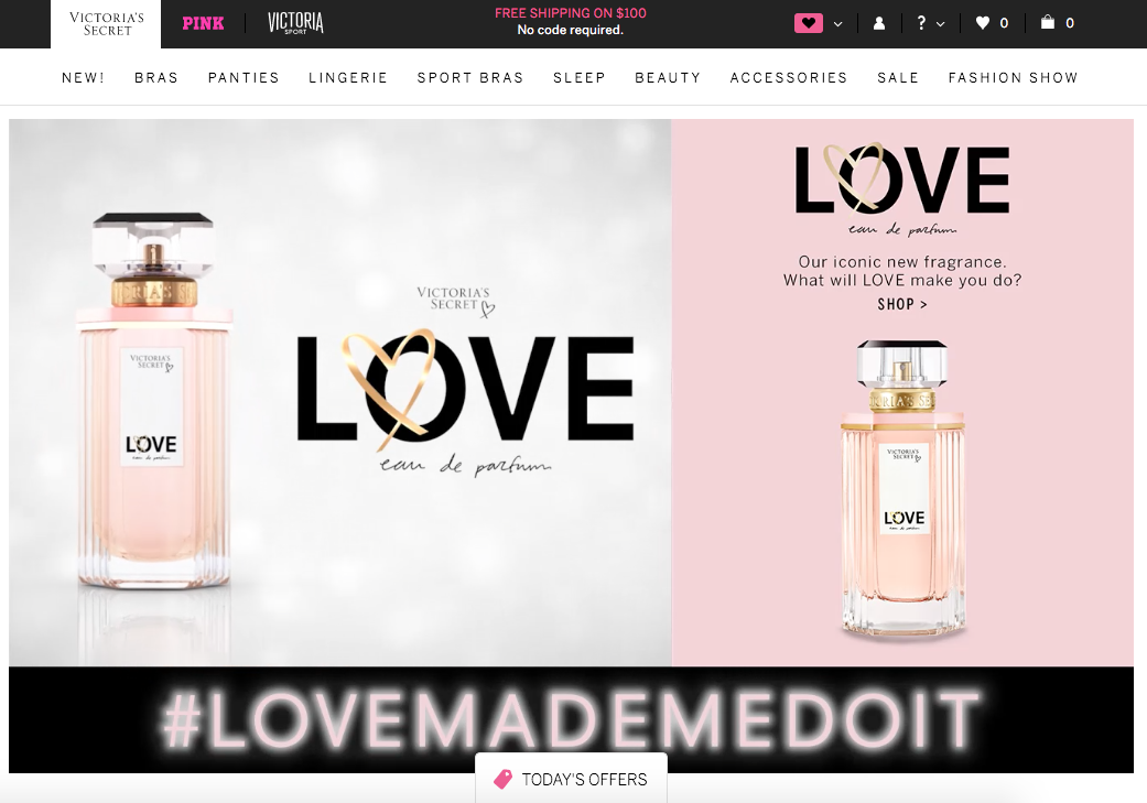
The company sells strictly women’s apparel, so they don’t need to worry about turning away men from their brand.
When a woman shops at Victoria’s Secret, the pink tones make her feel welcome.
Red
Stop at a stop sign. Stop at a red light.These are some of the things we think of when we see the color red.
It’s muscle memory and instinct.
But red represents more than that.
From a marketing perspective, red creates a sense of urgency.
That’s why you’ll often see red sales tags on discounted items.
Red tones appeal to impulse shoppers because the color can increase their heart rates.
Restaurants use this color to fuel a customer’s appetite.
McDonald’s has been using this strategy for years to lure hungry people into their restaurants.

From an emotional and personality viewpoint, red roses are a symbol of love.
Red evokes passion as well as intensity.
You can strategically use this color based on your industry.
If you want to increase conversion rates and deliver an urgent message, use red to draw the viewer’s attention to that area.
Yellow
If you’re using yellow on your website, it’s important to use it subtly and sparingly.Don’t use it for text because it’s hard on the eyes and tough for people to read.
Yellow represents happiness, joy, and cheer.
It’s a warm and happy color with an energizing effect.
There’s a difference between different shades of yellow and the way they represent age.
Bright yellow is used to represent children and their youth, while darker yellow designs signify a more mature age.
Here’s how yellow affects personality and emotion:
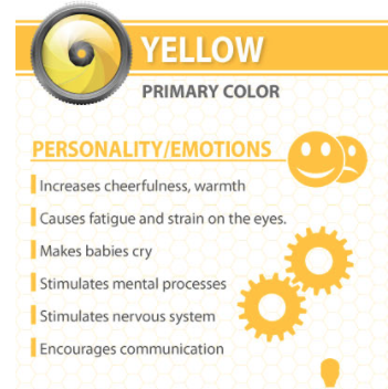
Overall, using yellow on your website will create a positive and appealing vibe.
However, it can also stand for caution or act as a warning sign.
Make sure your message is clear whenever you’re using yellow.
It works well to complement logos but doesn’t stand well on its own.
Orange
Orange isn’t a commonly used color.Earlier we saw that 33% of women and 22% of men said this was their least favorite color.
However, because companies use it so sparingly, it typically stands out when you see it.
That means it’s a great color for your CTA buttons.
Orange is a comforting color.
It’s got some of the same qualities as both yellow and red.
It’s sociable, energetic, and sunny.
Similar to red, it can often stimulate appetite.
Orange can also stand for affordability, which may be the reason why The Home Depot uses it in their logo:

Orange is friendly and energetic, but it’s not as overwhelming and hard on the eyes as yellow.
Purple
Purple ranked high in terms of women’s favorite color.It’s a beautiful shade that stands for royalty:
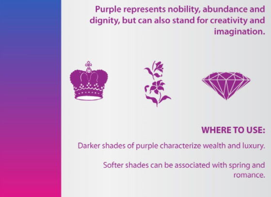
It’s a noble and romantic color as well.
Purple is luxurious and gives people the feeling of nostalgia, power, and glamour.
This color is also used to stimulate curiosity because it represents a mystery.
If you’re running some sort of surprise promotion in which a website user or email subscriber needs to click to reveal an offer, consider using a purple CTA button.
Purple tones are often associated with a ceremony as well.
They represent creativity and exclusivity.
If you’re trying to target a group of people who see themselves as high-class, you may want to consider incorporating purple somewhere on your website.
White
People often overlook white, but yes, it’s still an important color to consider in your website design.Although it may appear plain, white represents simplicity and purity.
It’s a clean design allowing a brand to signal perfection.
White logos are often used in health care industries.
It’s also associated with luxury brands and designs.
That’s why Apple uses a white logo in their website color scheme.
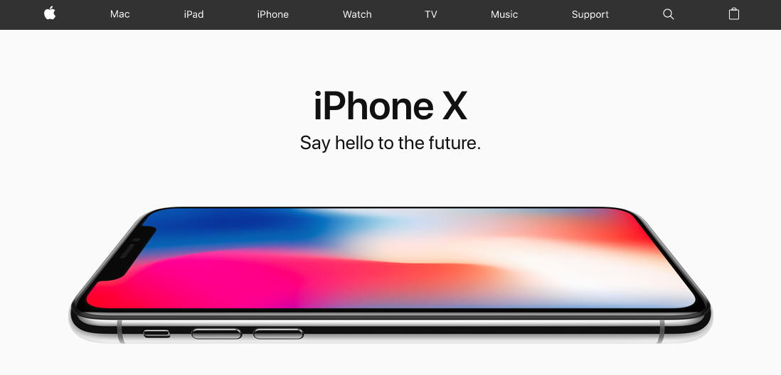
If you’re using white on your website, you can also use grey tones to compliment it, just like Apple does with the light grey background and dark grey text.
White is used to show high-tech products.
When associated with cuisine, white represents foods that have low fat.
To add sophistication or strength to your website, consider using a simple white and grey design.
Don’t use white for any buttons.
Instead, you can use a darker colored button with white font if you want to go that route.
Black
Black establishes authority.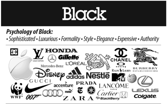
Similarly to white, it can represent sophistication, luxury, and elegance.
Products and brands that are black can be viewed as expensive—the opposite of orange.
So if your website is supposed to be for people who want a bargain, I’d recommend staying away from black.
Black is serious and can also be considered very somber.
I wouldn’t recommend using black if your company represents new life or rejuvenation because black is often associated with death.
Brown
Brown is commonly used in the following industries:- Food
- Agriculture
- Environment
Brown is a natural color that stands for dependability.
If you want to add a dark color to your website but don’t want to use black, consider using brown as a warmer alternative.
When a company uses brown in their logo, it shows customers that they are reliable:
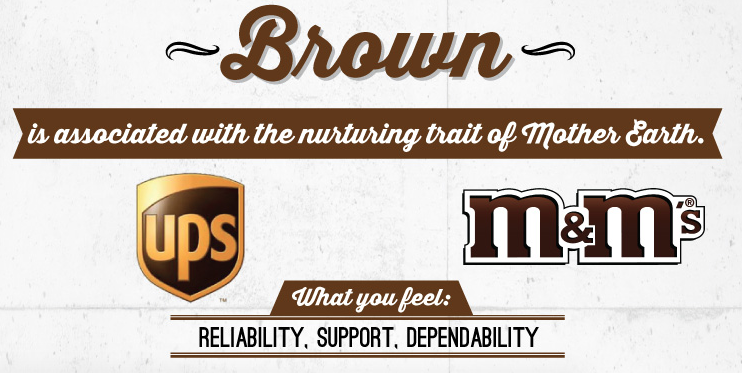
That’s why the slogan for UPS is “What can brown do for you?”
It’s a nice customer service color.
What color should I use for my website?
If you’re torn between a couple of different color choices, you can run an A/B test to determine which one gives you a higher conversion rate.Keep everything on your website the same, but change the background color, an accent color, or a CTA button color.
Experiment.
But don’t change the content or layout.
Here’s an example of a test for the CTA button color choice:

Everything on the website remains the same.
The only thing that changed was a green CTA button vs. a red CTA button.
Based on what we talked about earlier, green means go and red means stop.
So a hypothesis would be that the green button would outperform the red button.
However, the results of this test told a different story.
The red button saw a 21% higher conversion rate than green.
It’s surprising, but it’s good to know.
Just because you think you understand how people perceive certain colors doesn’t mean you shouldn’t run any tests.
The difference of 21% is so significant that it can drastically impact how much money your website makes.
Look, I’m not telling you this so you automatically choose red over green each time.
It depends on your brand, industry, and customer base.
I used this example to show why you should never assume anything and always run an A/B test to make sure you’re making the right decision.
Where to find the best color scheme for your website
Like I said before, it’s important to use different tones.Don’t just pick blue and make your entire website the same shade of blue.
Using a blue color palette is much more appealing.
I like to use Coolers.co to find color schemes that work well with each other.
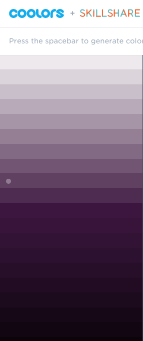
If you wanted to use purple tones on your website, this service helps generate a palette of purple colors.
You’ll get all different shades of purple from light to dark.
Pick and choose which ones you want to use for different parts of your website.
Consider using a lighter shade as the background and darker tones for text.
Conclusion
The color choices on your website appeal to the psychology of your customer.Don’t pick a color at random.
Make sure the colors you choose reflect your brand and company message.
It can impact your sales.
Think back to the example we used for A/B testing a CTA button.
A simple color change boosted conversions by over 20%.
Don’t miss out on an opportunity like that by not taking the time to carefully select the right colors for your website.
Look at your target audience.
If you’re trying to appeal to a certain gender, use colors like blue or pink.
For those of you who want to create a sense of urgency or an alert, red would work well.
Black and white colors symbolize authority, simplicity, and cleanliness.
Purple is a color of royalty, social status, and curiosity.
Follow the tips I outlined above to come up with a killer color scheme for your website to boost sales.
What feeling are you trying to evoke from your customers with your website colors?
No comments:
Post a Comment